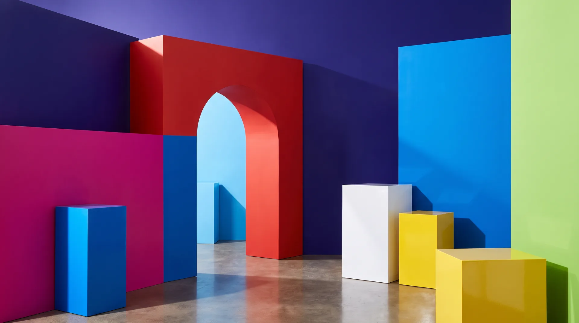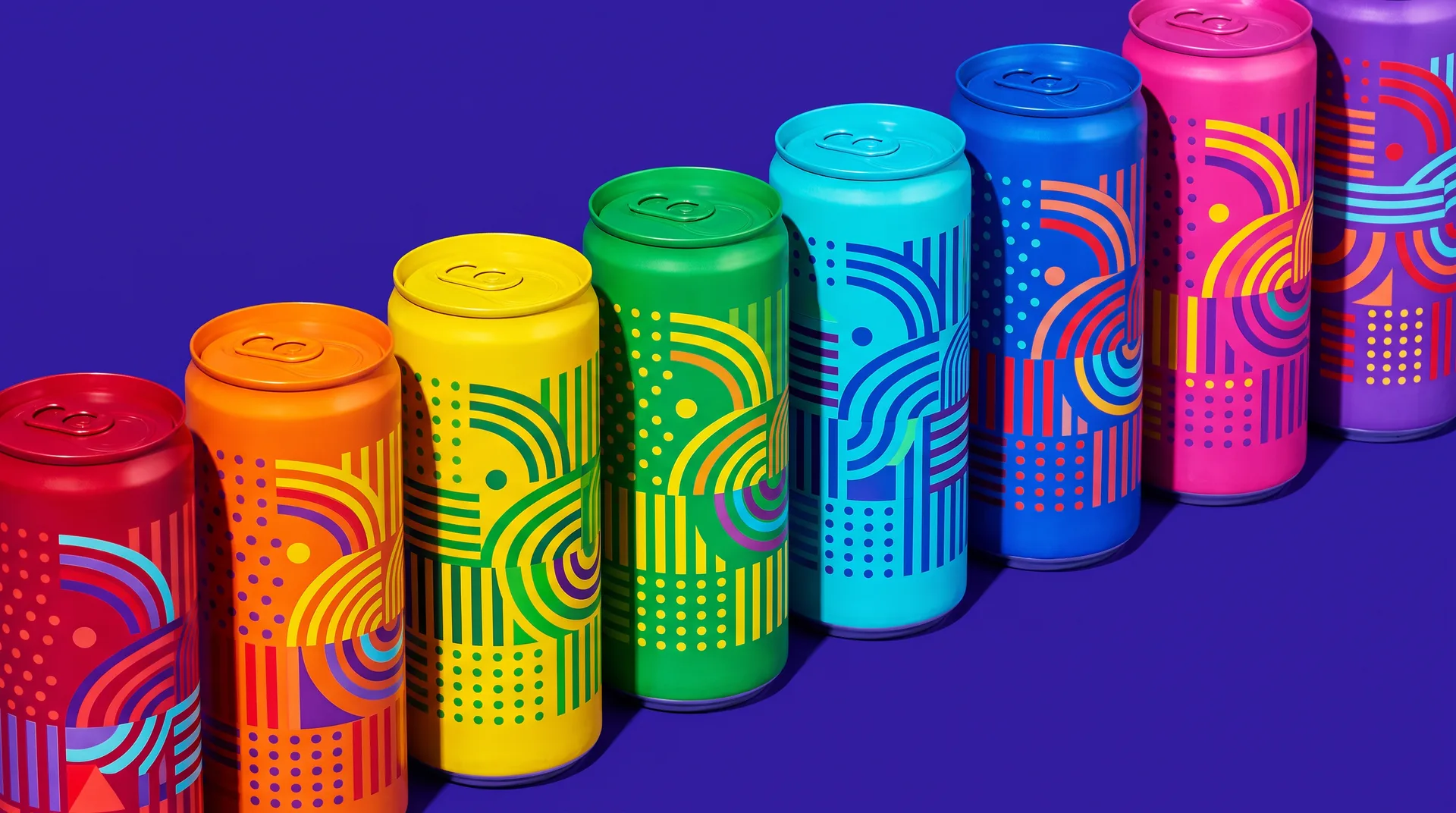
Midnight Kitchen
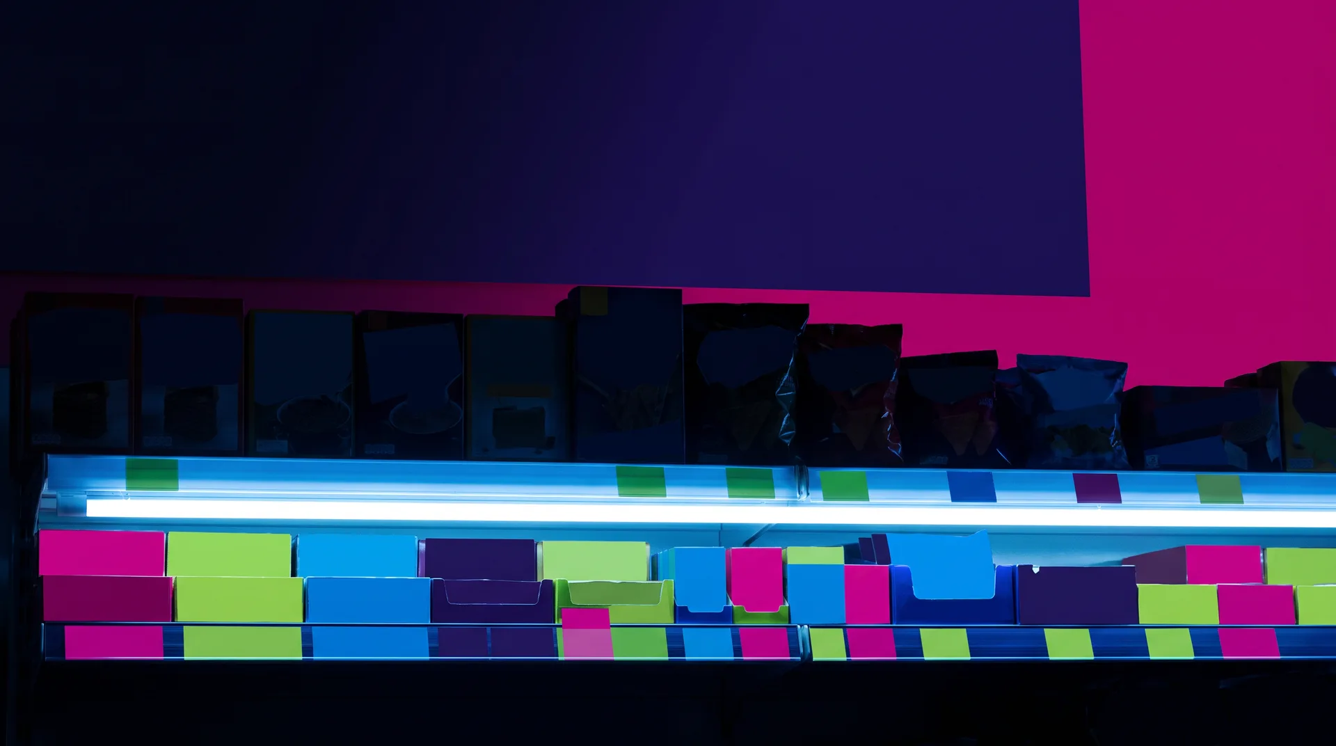
A Shelf That Only Opens at Night
A lighting and color design for late-night convenience store shelves. Combining fluorescent color fields with low-light conditions increased average night purchase time by 12 seconds.
- Client
- Midnight
- Discipline
- 공간과 경험
- Location
- 아시아태평양
- Year
- 2022
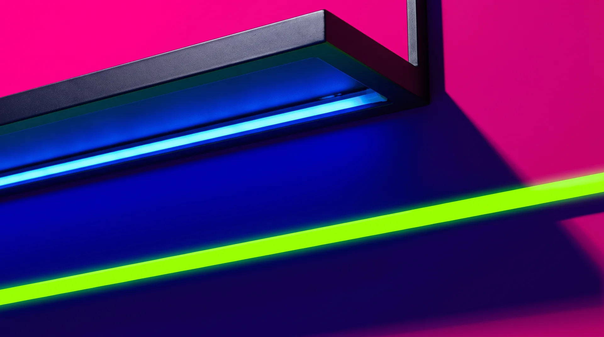
Everyone knows the same shelf looks different by day and by night, but most designs are built around daytime conditions. This project started with the night instead.
Background
During late-night hours, convenience store lighting drops to about half its daytime level, visitors are tired, and dwell time is short. Under those conditions, the existing shelves had every color pressed into gray. Bright colors turned murky, and dark colors disappeared.
Design
We kept only the colors that survive low light: two fluorescent tones, black, and white. Cool-toned linear lighting was installed at the top of the shelf, with no lighting on the lower shelves — when the top is bright and the bottom is dark, the eye scans from top to bottom.
We also redesigned the price tags. Night-shelf price tags use fluorescent numbers on a black background, which actually become clearer as the light gets dimmer. The numbers come in only three size levels.
Results
Across six pilot stores, average dwell time in front of the night shelf increased from 23 to 35 seconds. In shelf-recognition surveys, complaints about visibility in the dark disappeared entirely. Daytime metrics showed no change — the design built for night didn't hurt the day.
- Night-shelf dwell time: 23s → 35s
- 6 pilot stores
- Night palette reduced to 4 colors